When it fits, it fits.
The number one frustration, for those designing content for social media, would have to be proper sizing. Images are becoming more and more important for any brand-building or online communication. I have yet to find an easy mobile app that will address resizing on the run, but I have found one that addresses it on the desktop.
Someone out there like PicLabHD or WordSwag must be working on a "select your platform" option, right? I can only hope so. Meanwhile , I'll be using the "Use Custom Dimensions" tool at Canva.
Here is an excellent PDF showing the latest Facebook Creative Specs As of June 3, 2014
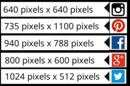
As of today, June 9, 2014 the ideal sizing for the most popular social media platforms are listed in this image. I don't use Pinterest, but I did build some samples of the other four images as templates.

I first took an image using the vertical position on my iPhone


Then I took a landscape photo of the same subject on my iPhone
Sizing G+ Images at 800x600 will make sure they show up the same on mobile and desktop. Twitter has a mind of its own. For now, we must bend to its wishes to be sure our message isn't be-headed or knee-caped. I saw a post of two of my friends talking last week and the Twitter preview only showed the parts of their bodies that told a different story than intended. Let's not do this to our brands!


Sample twitter photo size 1024 x 512 pic.twitter.com/BxbgtiJr87
— Nancy VanReece (@NancyVanReece) June 9, 2014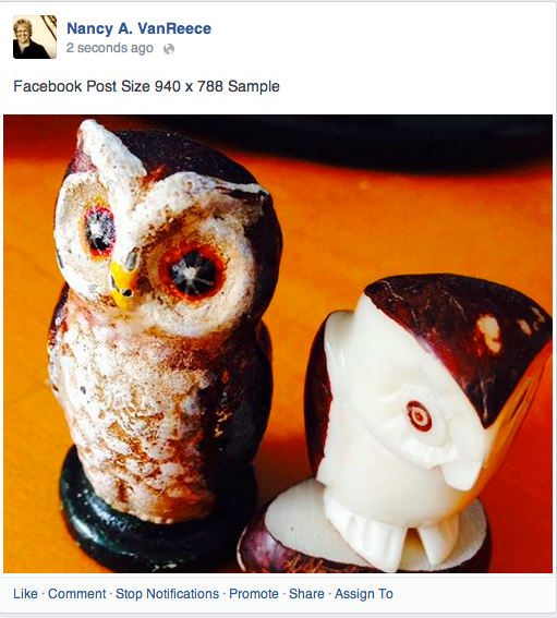

Google Plus Post on Desktop

Google Plus Post on Mobile
Confused yet? Get to Canva and set your templates. Yes, you can still take that square photo and send it everywhere, or you can create text on an image that people have to open to see. But taking the time to create your key original content is worth the trouble. Once you have that perfect fit, tailored just for you, it's hard to go back to the off-the-shelf images that seem easy.
Now someone please make this easier for mobile on the go creations! Do you have any photo resizing tips or comments?